GIFTS Inc. Website Redesign
Grandparents Involved From the Start (GIFTS, Inc.) is a national nonprofit organization based in Harrisburg, PA which addresses an important issue of Grandparents raising their grandchildren in poverty stricken environments. Due to horrific life occurrences such as gun violence, substance abuse, and incarceration, GIFTS Inc’s mission is to bring awareness and become a go-to resource for Grandparents solely raising their grandchildren.
Additionally, the organization is also heavily involved with community outreach programs that addresses the importance of child mental health, along with sociological concerns centered around food deserts in both rural and urban environments.
Team:
Asha Jones, Principal UX Designer
Dolorez Cobb-Jones, GIFTS Inc. Executive Director
GIFTS, Inc. Board of Directors
Table of Contents
I. Introduction
II. Research
Defining User/Organization Needs
Discovery
Affinity Mapping
III. Synthesis
IV. Definition & Ideation
Persona & User Journey Map
Information Architecture
Wireframing
V. Deliver and Test
Usability Test
Visual Design
High Fidelity Design
Other Pages
I. Introduction
GIFTS, Inc. is designed to help educate and provide resources for distressed grandparents, who for various reasons, are left to raise their school-aged grandchildren. Nationwide, in both rural and urban communities, there are millions of people that can benefit from learning their grandparental rights, along with understanding how to maneuver through the education system. As the Principal UX Designer, my goal is to portray how GIFTS, Inc. educational resources can best be utilized and to connect grandparents with one another to build community.
The GIFTS, Inc. website is one of the primary channels to interact with the organization and to connect with the resources on grandparenting. How might we create an easily accessible digital platform for a non-profit organization so that the users can better understand its offerings?
Create a viable online website prescence for a Nonprofit Organization that will
provide resources and supportive tools to grandparents raising their
grandchildren.
II. Research: Defining User-Stakeholders Needs
To begin with the creation of the GIFTS, Inc. website, I created a robust research plan to better understand the stakeholders’ ask, along with the user’s need. The research plan comprised of three phases:
Researching articles and websites on grandparenting and advocacy rights.
Conducting Stakeholder interviews and Grandparent focus groups.
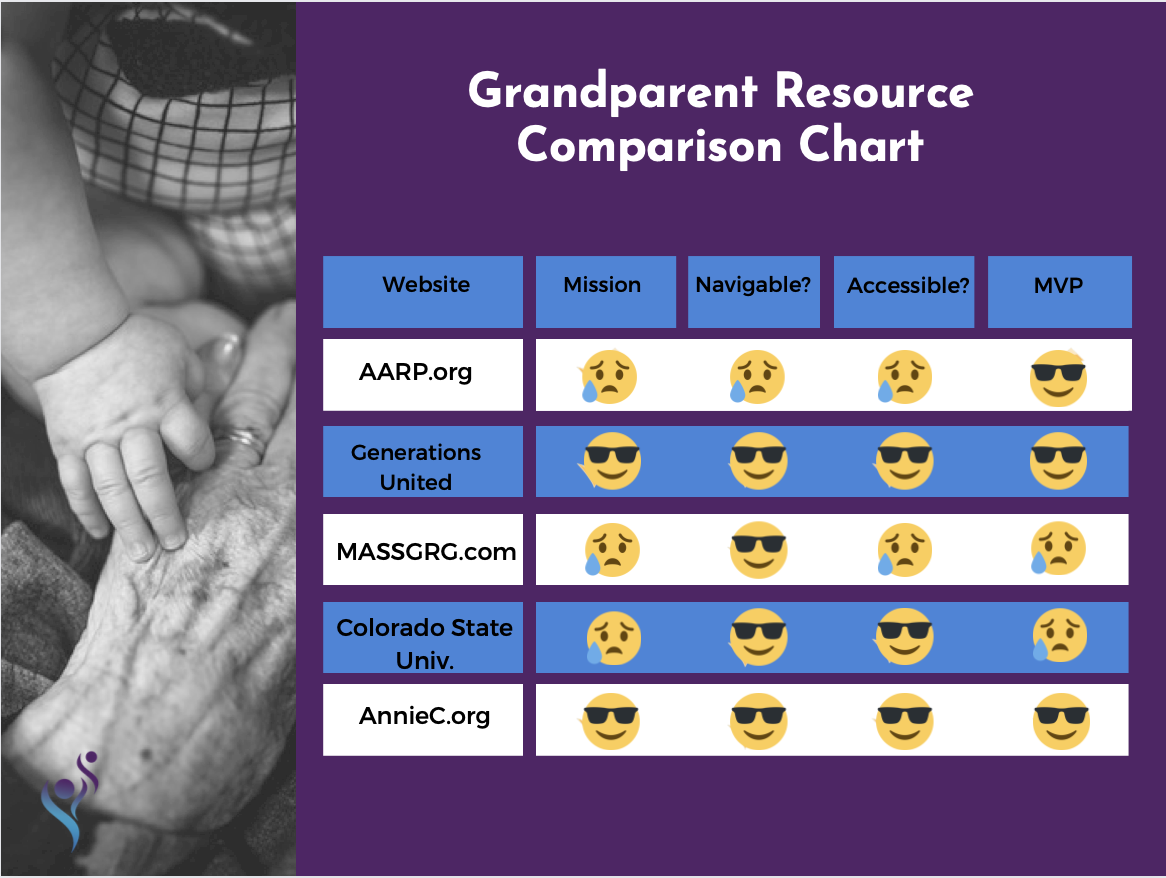
Developing a comprehensive competitive analysis to understand potential needs, goals, and frustrations that occur while using the website.
Research Findings and Insights
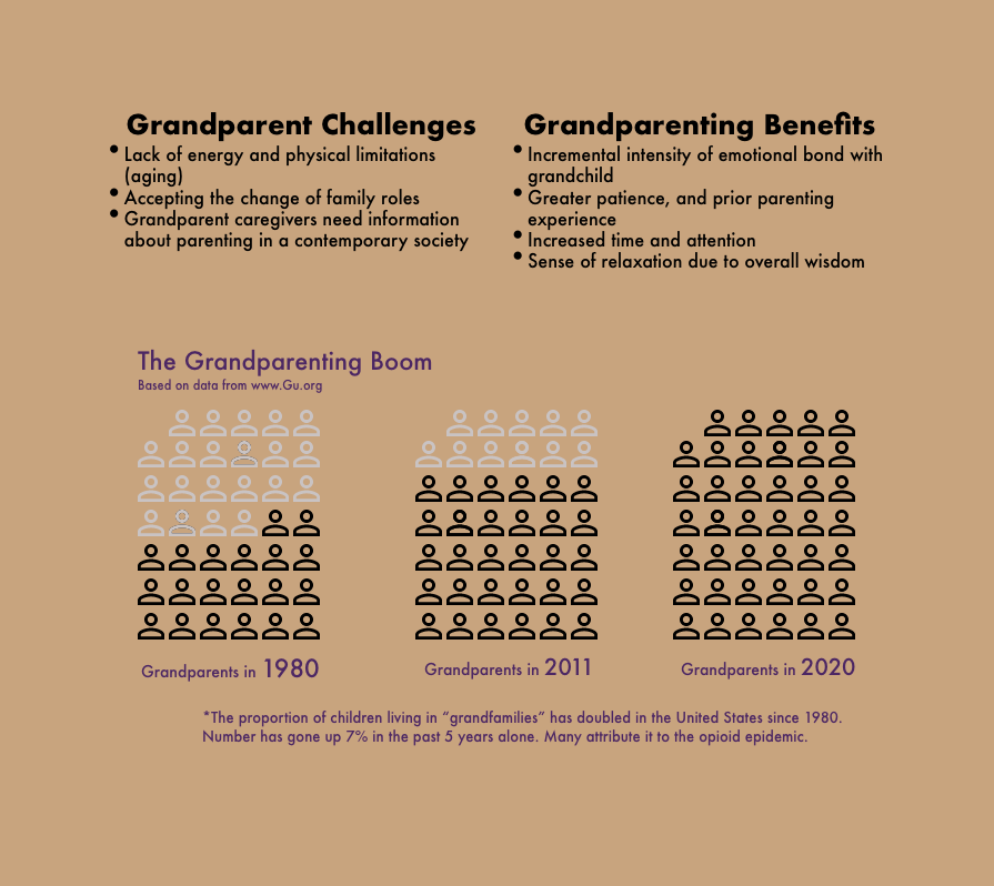
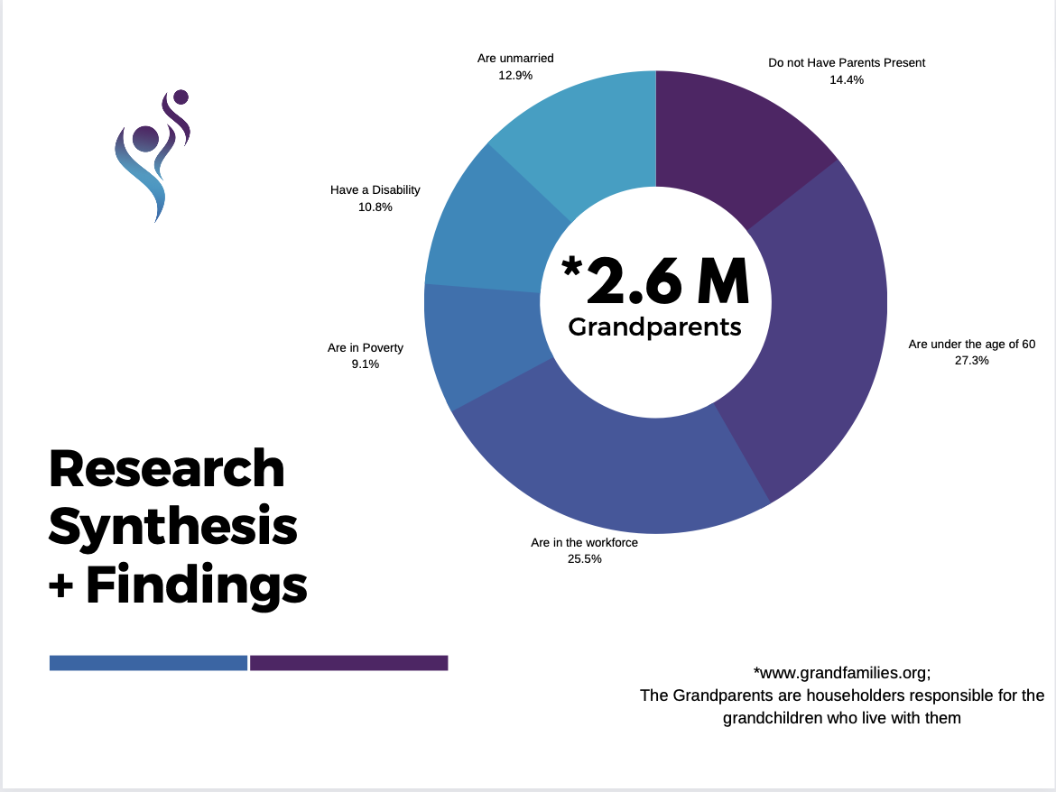
In order to help define the scope, target users, and a problem statement of GIFTS, Inc., I began researching scholarly articles and other organizations that possibly provided similar offerings. From this research I solidified both challenges and benefits Grandparents face as they raise their grandchildren.
User/Stakeholder Surveys and Focus Groups
After verifying the potential user, I conducted interviews with over a dozen potential users of the website, as well as the organizations’ stakeholders to validate my assumptions.
User Interview results revealed that the majority of participants were interested in GIFTS, Inc. and wanted more grandparenting support. However, I noticed that they had difficulty finding a central place for resources and information.
Stakeholder interviews revealed that their primary goals are to spread awareness and to help grandparents better understand how GIFTS, Inc. can be a major source of offerings.
“As a widowed Grandmother to 2 young boys, day-to-day life can be pretty tough. I would like to have a support groups for the grandparents who are in similar situations such as myself. I would love to see that!”
Affinity Mapping
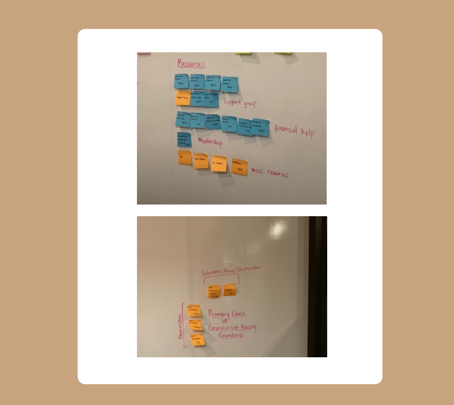
Based on a compilation of gathered insights through articles and surveys, I conducted some Affinity Mapping exercises in order to get a complete picture of trends, and areas of opportunity for discovery and improvement. Below is the Affinity Map, which summarized some leading causes of Grandparenting, along with some possible resources Grandparents would like to see.
III. Synthesis
Based on compiled data and feedback, I began to better outline some high priority delieverables for GIFTS, Inc. I had full creative control in determining the features of the site, so I started simple. After some talks with the Founder and Boardmembers of GIFTS, Inc., we decided that the main features of focus should be:
Volunteer sign-up form
User-Friendly Resources Page
Seamless Donation Form and Process
About Page
Events Section
Contact Section
Blogging
The three bolded bulleted items turned into the minimum viable product (MVP).
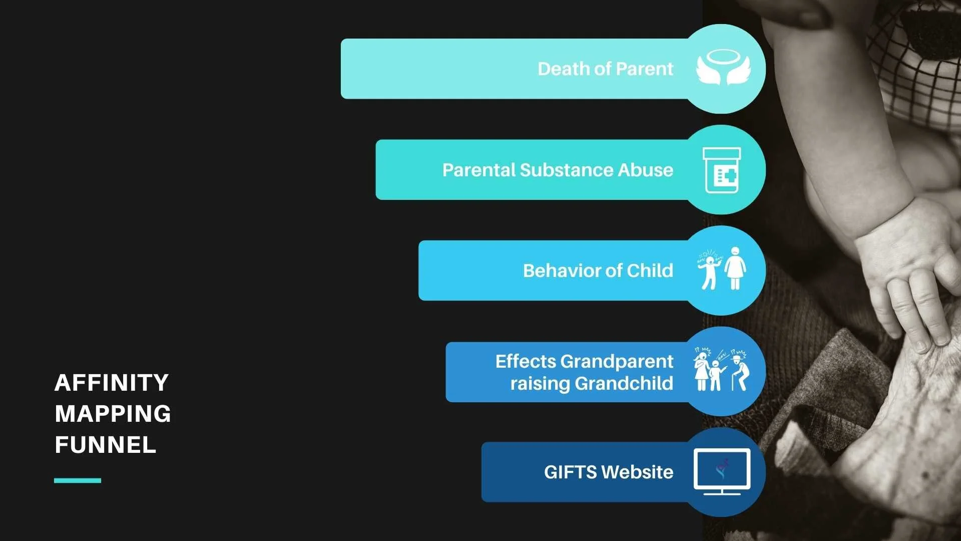
Based on insights from the Affinity Map, on the left is an inverted pyramid formed into a funnel. At the top of the funnel are the two leading causes as to why Grandparents are called to step in and raise their grandchildren. From my findings, those leading causes directly affects the behavior of the child. The bottom of the funnel then translates the cause and effect into a viable solution: An all-encompassing online resource for grandparents.
IV. Definition and Ideation
Persona and Journey Mapping
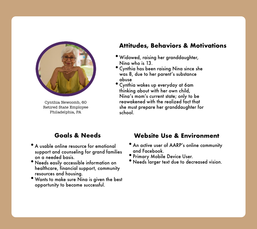
After I reviewed all the information gathered from my research, I created a user persona in order to clarify the website’s direction. Personas helps visualize the key problem, empathize with the user and move toward Ideation.
I created a user persona based on the synthesized research and further feedback I gathered from the CEO & Founder of GIFTS, Inc.This helps me visualize the key problem, empathize with the user, and move onto the third phase of the Design Thinking process: Ideation.
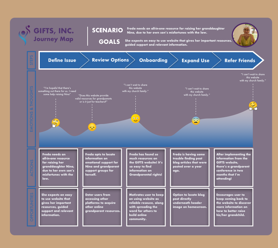
To the left is a user journey map that is a visual representation of the customer experience. This map depicts the GIFTS, Inc. website from Freda'’s point of view and can be a key part in user experience design and optimization.
The process of mapping Freda’s journey encourages and reminds myself to consider the entire customer experience: their feelings, questions and needs while they interact with the site I’ve created. It’s used for understanding and addressing customer needs and pain points.
Information Architecture
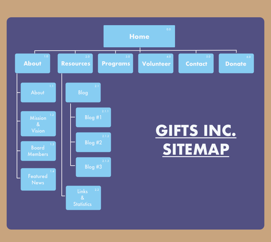
As we set our goal to organize and structure the content of the homepage, I conducted some IA exercises to gain further insight as to how to structure the website’s content. In order for a digital product to be usable, it should first be findable.
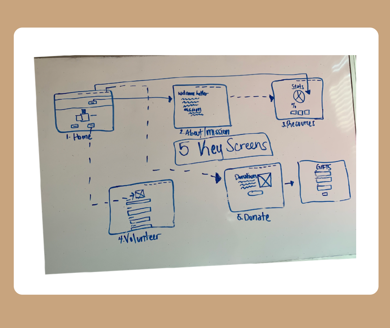
The sitemap and user flow advised the key screens used to create a low-fidelity wireframe.
The sitemap helped me determine where content for the GIFTS website should be placed and how it should navigate. Also, the sitemap informs the wireframe design as it pertains to hierarchy and structure. Below is a glimpse of the breadth and depth of the navigation.
Subsequently, I built a user a user flow to depict how the pages within the sitemap will flow together and how the system interacts with user behavior.
Happy Path Task Flow
The solid lines represents a happy path for the primary user, which would be the Grandparents, looking for more resources and/or information about the non-profit as a whole.
The dotted lines represents a path for the secondary users: Stakeholders, Educators, people looking to donate and/or volunteer etc.
V. Deliever and Test
User Testing
Since this case study is for an actual organization, testing of the website is constant and frequent. However, because I’ve been a remote UX Designer for this project since before the global pandemic, I’ve always conducted an exploratory like sessions. One in which I would record user in-person with a moderator script and observe how they maneuvered through the website. Additionally, from a more remote standpoint, and, in order to discover the perspective of the exact user base, I asked senior citizens to give their opinion about what they saw, first impressions, and discover any assumptions about the purpose of the website.
In order to user test, I used InVision to test the screens with the Founder of GIFTS, 4 members of the Board, and 3 Grandparents that wanted to learn more about the organization from it’s inception.
Key Findings
Load time on the website was slow.
Navigation was pretty easy, but users struggled to understand the different tab meanings.
3 users expected to find even more resources for grandparents and requested that the grandparents should be able to connect directly on the website with on another.
Text needs to be even bigger.
Color contrast was fairly received.
Testing assisting me in finding out my audience’s expectations of the website, while confirming the value of the nonprofit from the stakeholder’s point of view.
Wireframing
After defining the overall architecture of the website and navigation through IA, I started to create a low fidelity wireframe for interface development.
While creating these screens I focused on:
Maintaining consistent Accessibility WCAG 2.0 Standards given the user base demographic of 49-72 years old senior citizens.
Straightforward design while not hiding important features and information.
Keeping things intuitive by leveraging the existing mental models of senior citizens.


Visual Design
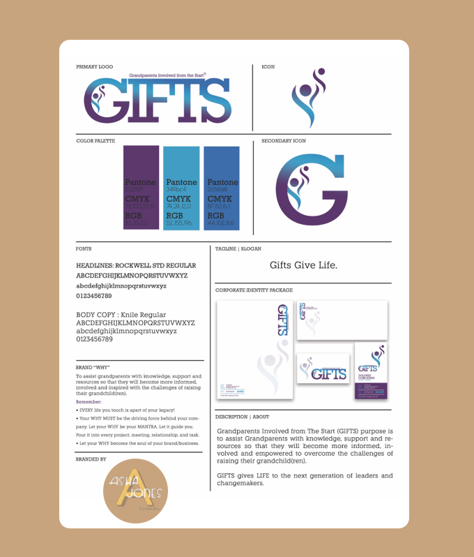
GIFTS, Inc. is a nonprofit organization geared to help educate and spread awareness of Grandparents who are called to solely raise their school-aged grandchildren in poverty stricken environments. The UI is regal, modern, yet organized, inspired by the unconditional love and selflessness these individuals exude on a daily basis. The PARC principles (Proximity, Alignment, Repitition, and Contrast) were considered in this design.
For logo creation, I designed an abstract person figure hovering over a smaller person figure as a sign of protection and guardianship.
High Fidelity Design
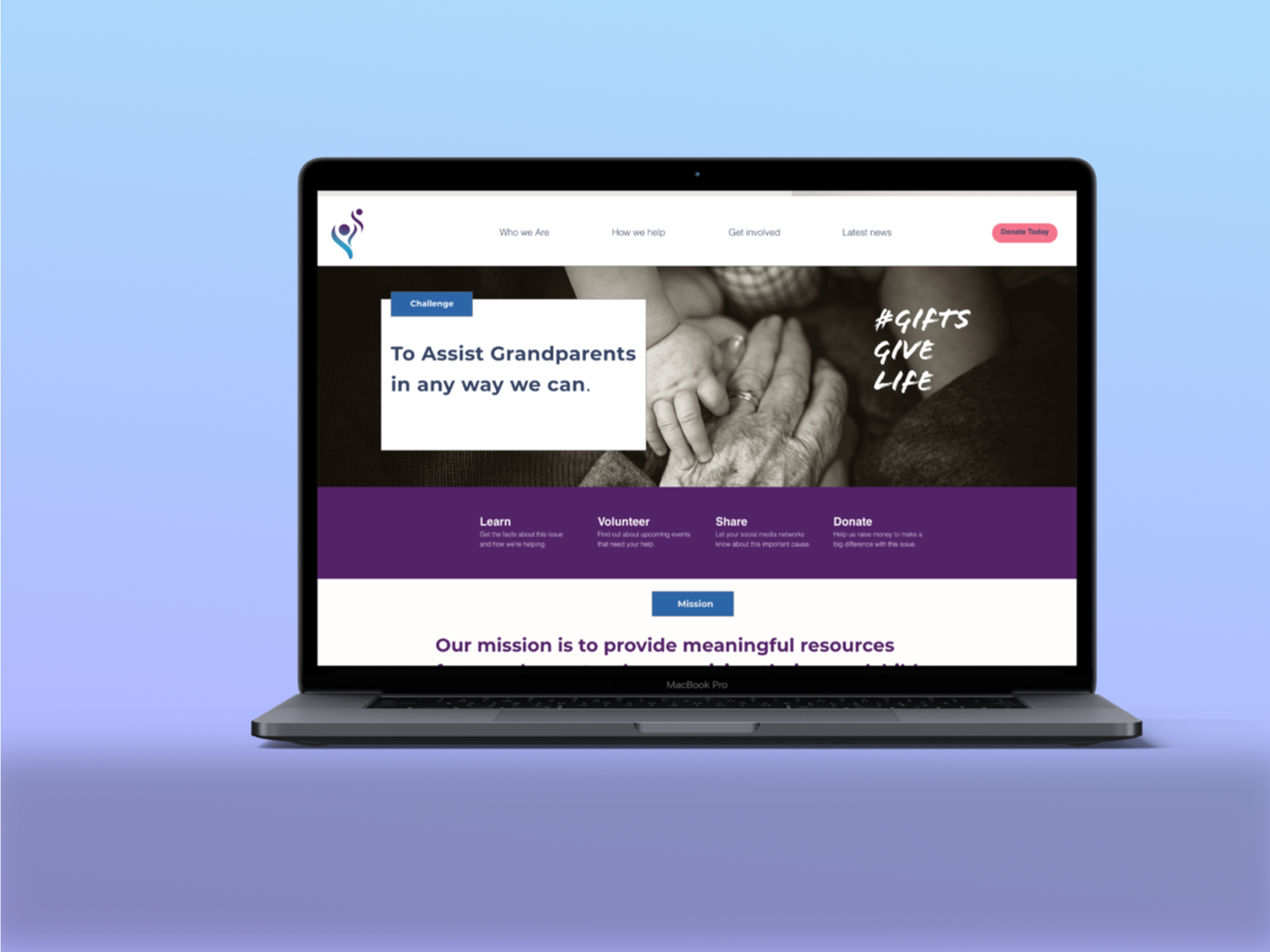
For the final design of this project, to cut developer cost, I decided to use my high fidelity wireframes made in Sketch and transfer them to squarespace. Also, in order to display large images and text, we collectively determined to cut down on the tabs and use a single column layout for the homepage.
VI. Reflection and Next Steps
As GIFTS, Inc. was one of my first projects for an actual organization, I learned so much. I was able to coordinate user and stakeholder opinions to create the more ideal outcome.
I still work with GIFTS on a more freelance basis, as I keep the website updated and create branding materials for upcoming events.
In the future, I plan to gain even more usability testing, in order to gather additional unbiased feedback, which will further help me create a better overall user experience for my audience.
P.S. I strongly believe we need to raise awareness of the amount Grandparents raising their grandchildren out of reasons beyond their control. Let’s uplift and support them in any way we can.
If you or someone you know would like to get involved in a usability session or have any ideas of how to improve this concept, let’s chat!

