Coca-Cola Accessibility POS Redesign
Product Design
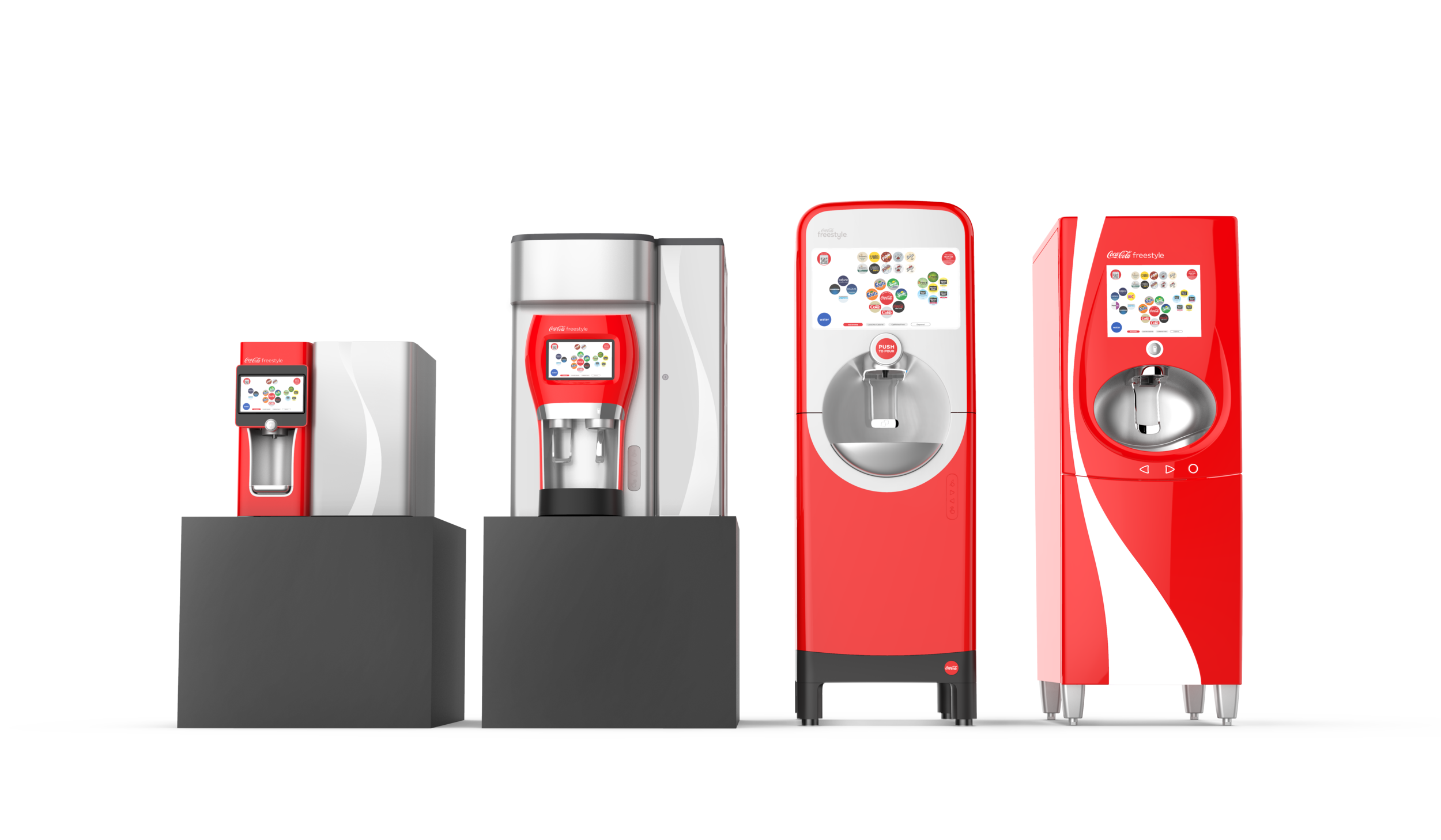
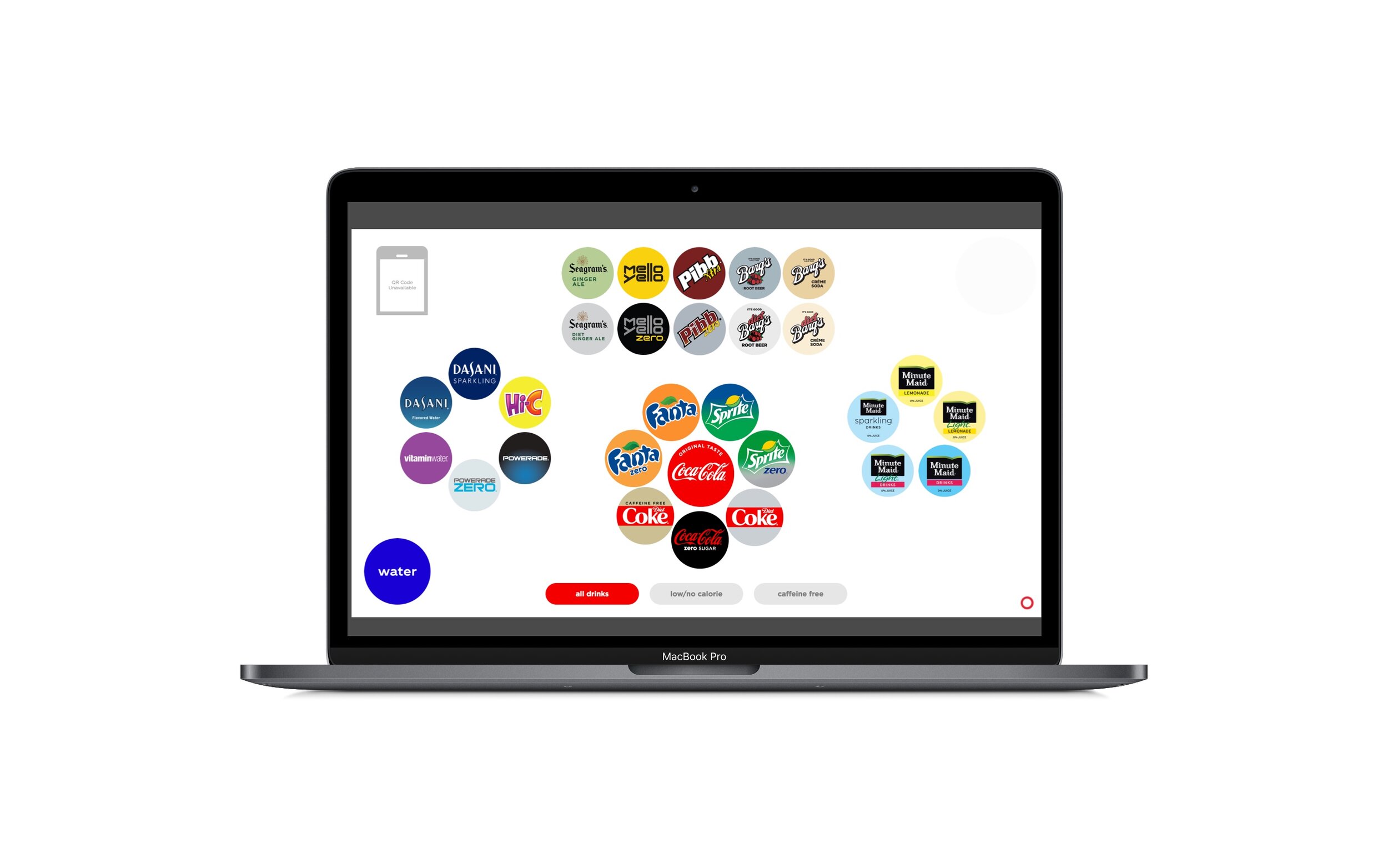
Coca-Cola wants to create a better user experience for its customers who are physically disabled, and in particular visually impaired. The Freestyle machine is used to dispense Coca-Cola beverages at restaurants, theme parks, movie theaters, and stadiums.
Table of Contents
I. Facts at a glance
Risks/Assumptions
II. Overview
Executive Summary
III. Context & Challenge
Problem Statement
Defining Key Pain Points
IV. Background/Description/Today’s Solutions
Today’s Solution
Persona
V. Process & Insight
Brainstorming Session
Kickoff Meetings
Research
Sketches & Wireframes
VI. Key Takeaways and Reflection
I. Facts At a Glance
Project Name: Coca-Cola Freestyle Accessibility Dispenser Redesign
Role: Researcher
Client/Geography: All consumers with visual impairments who use Coca-Cola dispensers at various restaurants, sports arenas, places of employment, etc. Coca-Cola Headquarters in Atlanta, GA.
Industry: Beverages
Audience/Users: All consumers with visual impairments who use Coca-Cola dispensers at various restaurants, sports arenas, places of employment, etc.
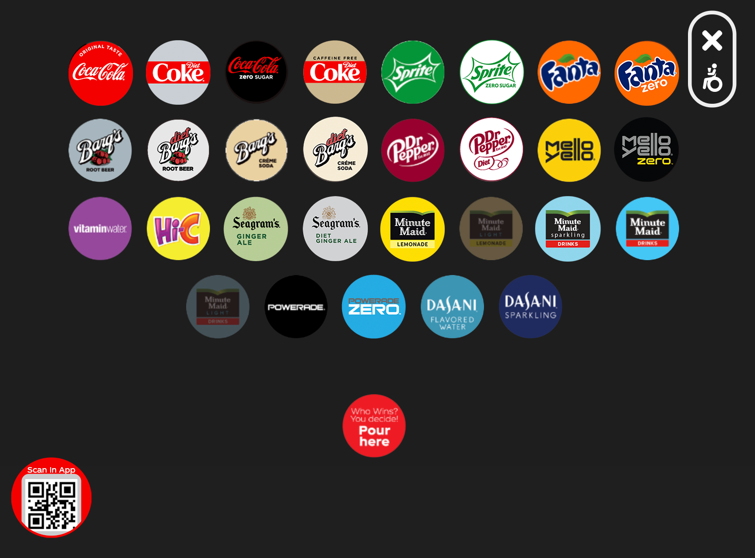
Challenges: Our newest dispensers, the 9100 model is not properly ADA Compliant. ADA button on dispenser is completely hidden from user. Several different kinds of impairments.
Results: Ongoing project into the New Year (2020)
Risk/Assumptions: “Do people with different types of visual impairments have completely different UI needs?”
Solutions: Completely new re-design of Accessibility UI screens to accommodate a wider range of consumers who experience physical disabilities.
Technology/Tools Used: Sketch, Photoshop, 9100 Coca-Cola beverage dispenser, iPhone
II. Overview
Executive Summary
As a product designer in the beverage industry, we are the conduits of change and improvements of digital products for all of our users. The act of simply going up to a soda dispenser machine to select your favorite beverage to drink can often times be overlooked by many. However, because of the lack of strategic User Interface changes, this task can go from uncomplicated to incredibly frustrating for those who experience many different types of visual impairments.
III. Context
“How might we create a more centralized ADA compliant User Interface for our users when there are several, if not dozens of different kinds?”
Challenges
When attending concerts, sporting events, the movies, or even sitting down at limited service restaurants such as Nando’s or McDonald’s, selecting a beverage to drink at the soda dispenser can be quite a daunting task for those who experience visual impairments.
In the U.S. there are approximately 285 million people who have a visual impairment. The impairments widely range from mild severe to legally blind.
How might we create a more centralized ADA compliant User Interface for our users when there are several, if not dozens of different kinds?When attending concerts, sporting events, the movies, or even sitting down at limited service restaurants such as Nando’s or McDonald’s, selecting a beverage to drink at the soda dispenser can be quite a daunting task for those who experience visual impairments.
Defining Key Pain Points
1. How to create an accessible and seamless user interface for individuals who experience many different types of physical disabilities and impairments. (User Perspective)
2. How to decrease the number of lawsuits administered from the ADA community who claim that the Coca-Cola dispensers are not ADA compliant?
Though it doesn’t necessarily near the severity of a visual disability, I, myself have a partial visual impairment as I’ve been wearing prescription eyeglasses for the majority of my life. As my vision is especially blurry when viewing things further away, I must legally wear glasses to operate any vehicle, along with needing glasses to watch television and to attend concerts or live venue outings.
As such, at its basis I can empathize with individuals who feel limited in their capabilities of wanting to be more independent in performing everyday tasks. Some of these tasks include driving, cooking, or getting something to drink at an unfamiliar restaurant. I can only imagine how difficult it can be to use a machine that’s meant to be extremely user friendly, turn into an entire mental obstacle course all to receive one beverage! This slows down the selection and dispense time plus it also generates opportunity for giant misunderstandings.
IV. Background & Persona
Today’s Solutions
A typical day for Allie starts with her husband, Jack taking her to work at the Coca-Cola Company. Luckily enough, when Allie goes to select her normal Diet Coke from our dispensers, she’s memorized it selection placement. Because of her visual impairment, if it weren’t for that, she wouldn’t know what to select to drink on the dispenser.
Persona
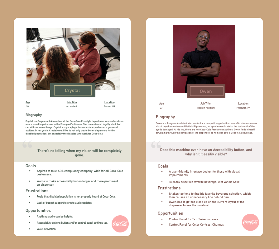
To gain a better understanding of who we were building for, we created personas. This allows us to anticipate what users may encounter on a day-to-day basis and how the Accessibility re-design can help with the customers process. of receiving his or her Coca-Cola beverage.
V. Process and Insight
Team Roles & Insight
As a team, we decided to start the process with a discovery call. Other than myself, some other colleagues who were included on the call were:
Myself, UX Researcher & Designer
Elaine, UX Information Architect & UX Designer
Director of Community Connections
Director of Product Management
Systems Analyst
Allie, Sr. Manager of Channel Planning and Development
Legal team
Sr. Commercialization Manager Freestyle
We rallied together in order to uncover an opportunity to create better Coca-Cola dispensers for ADA compliancy. This opportunity came about after attaining a considerable amount of feedback and legal issues from customers.
We began the discussion listening to Allie’s POV. With that, she revealed a great amount of insights. Because she was speaking from a visually impaired perspective, she highlighted main factors that could help shape the re-design work. The 3 main factors included:
Brand Prominence
Audio is King
Because >10% of visually impaired persons read braille or have a guide dog, focusing on braille readings might not be as effective as previously imagined and currently designed on the dispenser themselves.
I found an educational app to learn about different types of eye diseases and how people who have these
diseases see things.
“I do wish the developers add settings for floaters, random strobing lights, and swirling lights as those are all things that are going on at the same time as the restricted peripheral vision.”
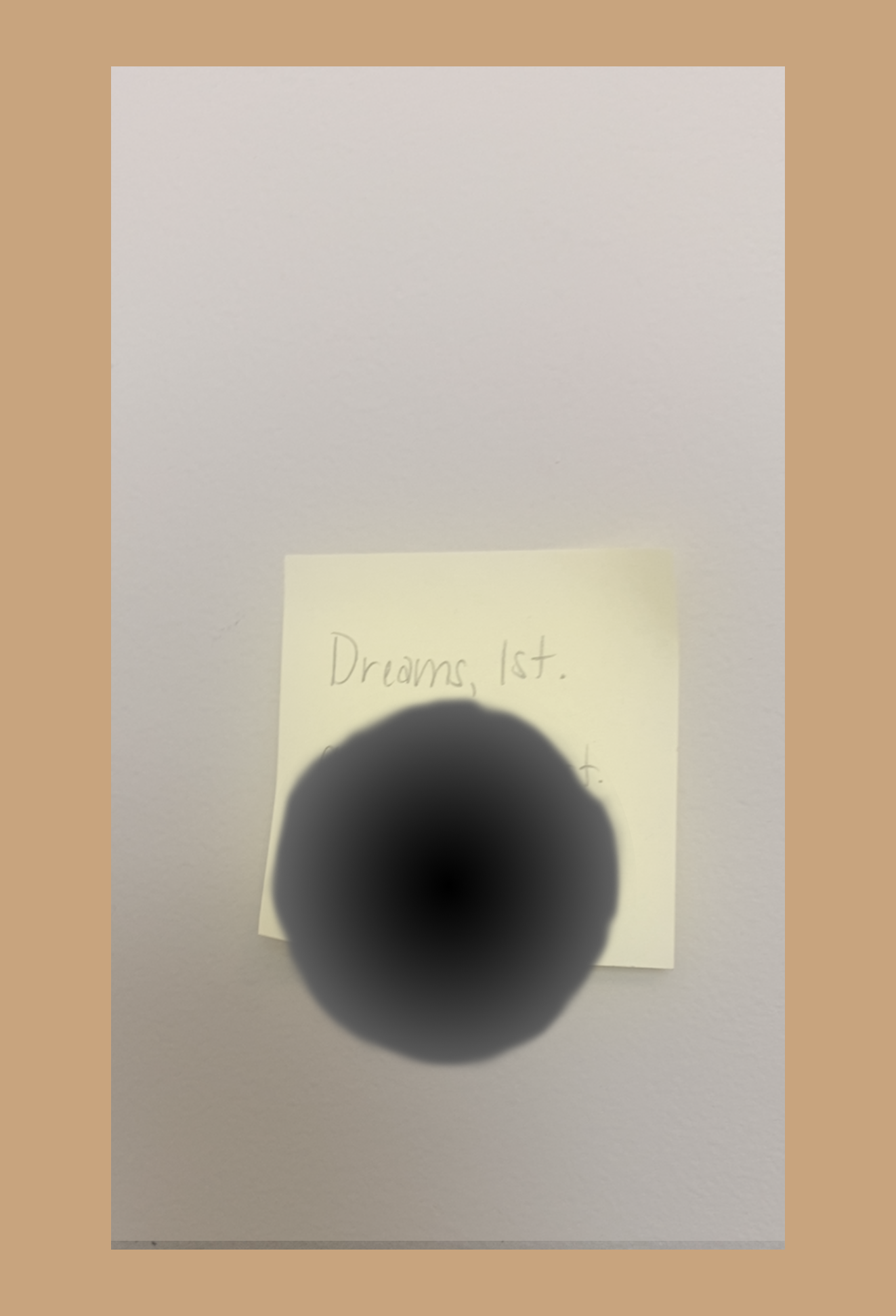
Stargardt's Disease

Cataracts

Retinitis Pigmentosa (RP)
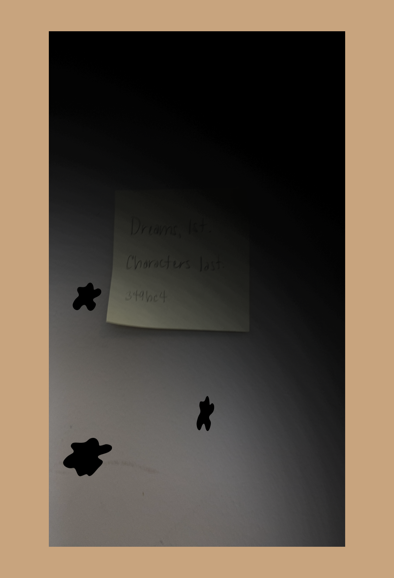
Retinal Detachment
Accessibility
Majority of the users for dispensing the Coca-Cola Freestyle Machine would be people ranging from the age 6-80 of all racial backgrounds and disability groups. The people who suffer from visual impairments may either typically be older with low vision or may have trouble seeing the screen altogether, no matter the age. According to the WCAG Accessibilty 2.0 Standard, large White text contrasting against a dark User Interface is optimal for a wide array of vision disabilities. Large buttons and touch targets help users by giving them enough space with or without motor difficulties.
We found that an audio feature would be key with those who have serious visual impairments. However we found that inserting an audio component would mean that the Freestyle machines would have to be completely re-built, costing the company an unnecessary amount of re-building costs.
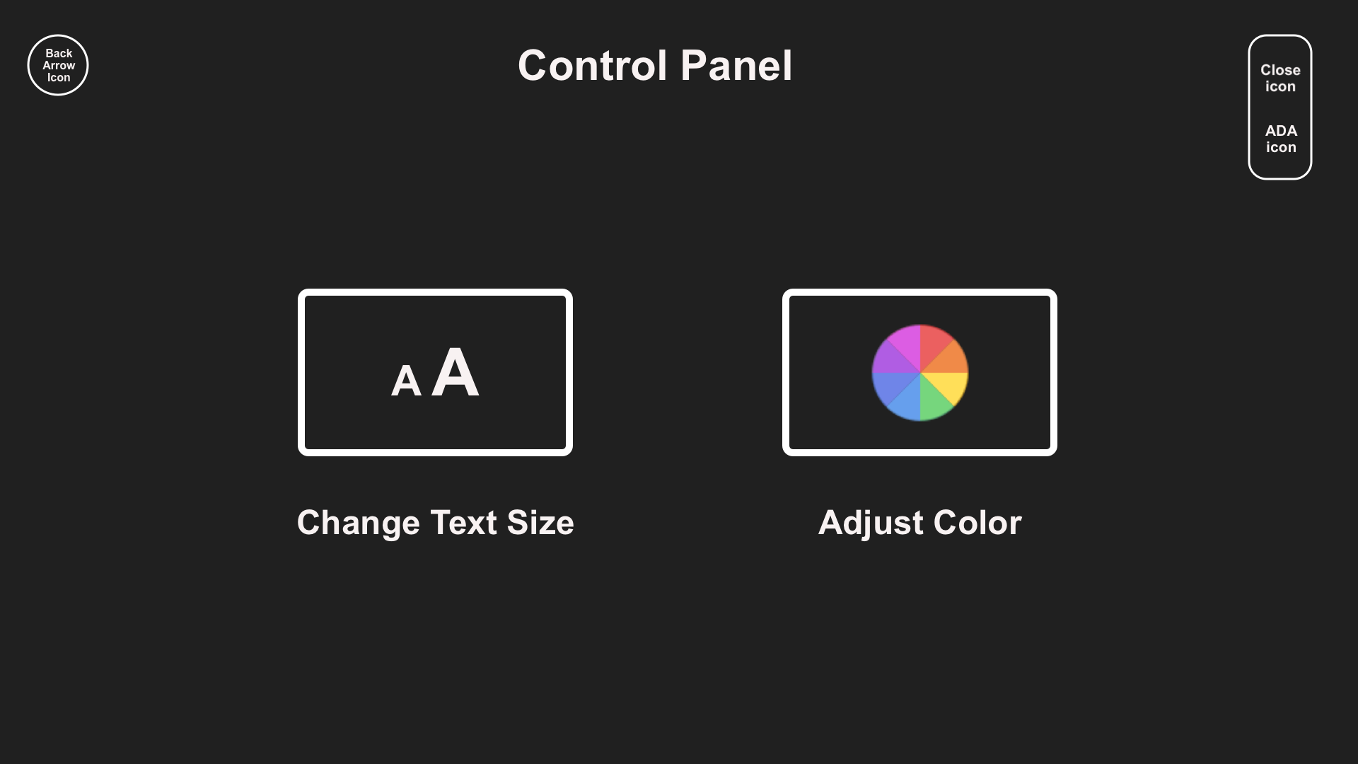
Control Panel Wireframe
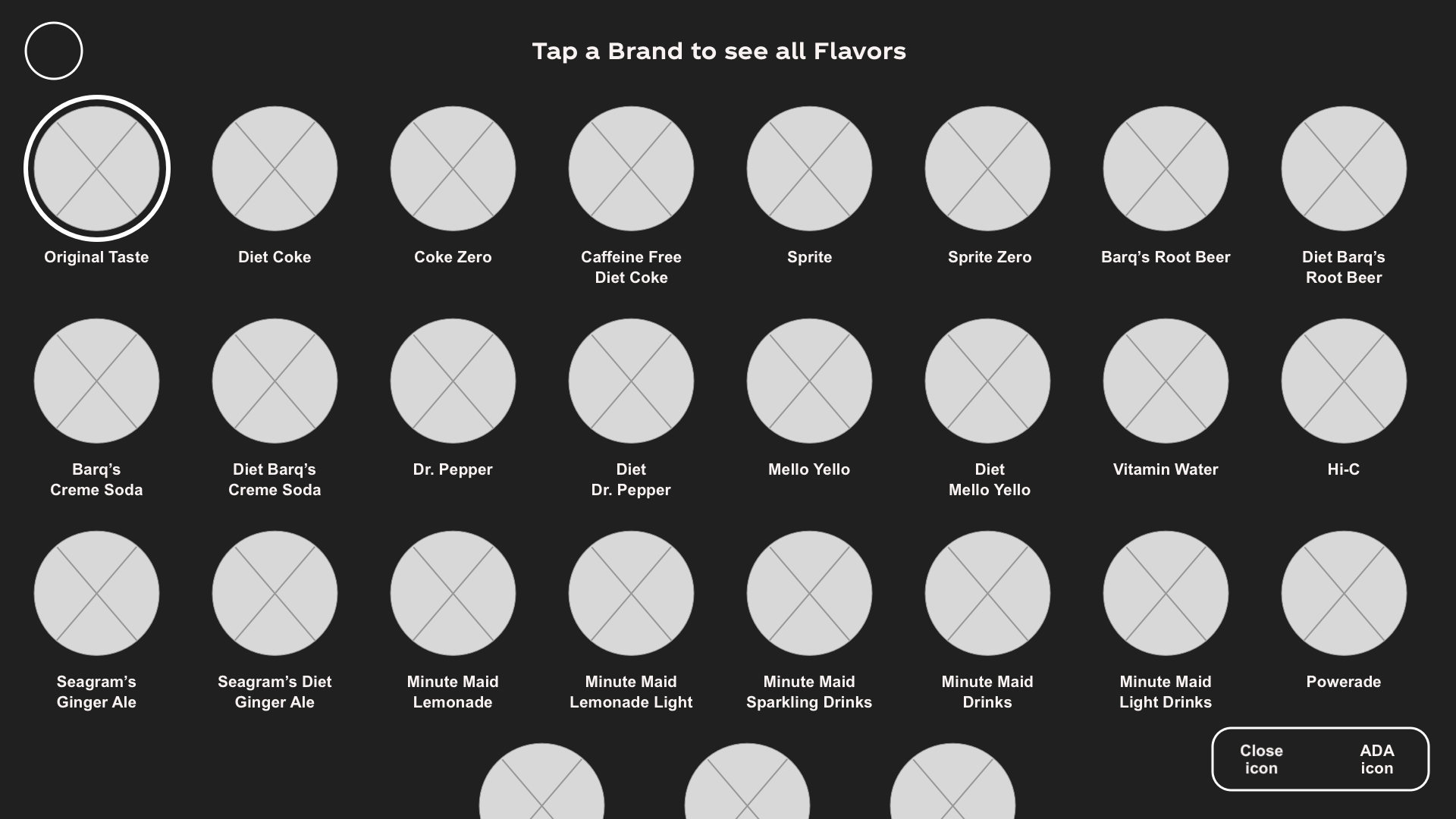
Wireframe with Caption
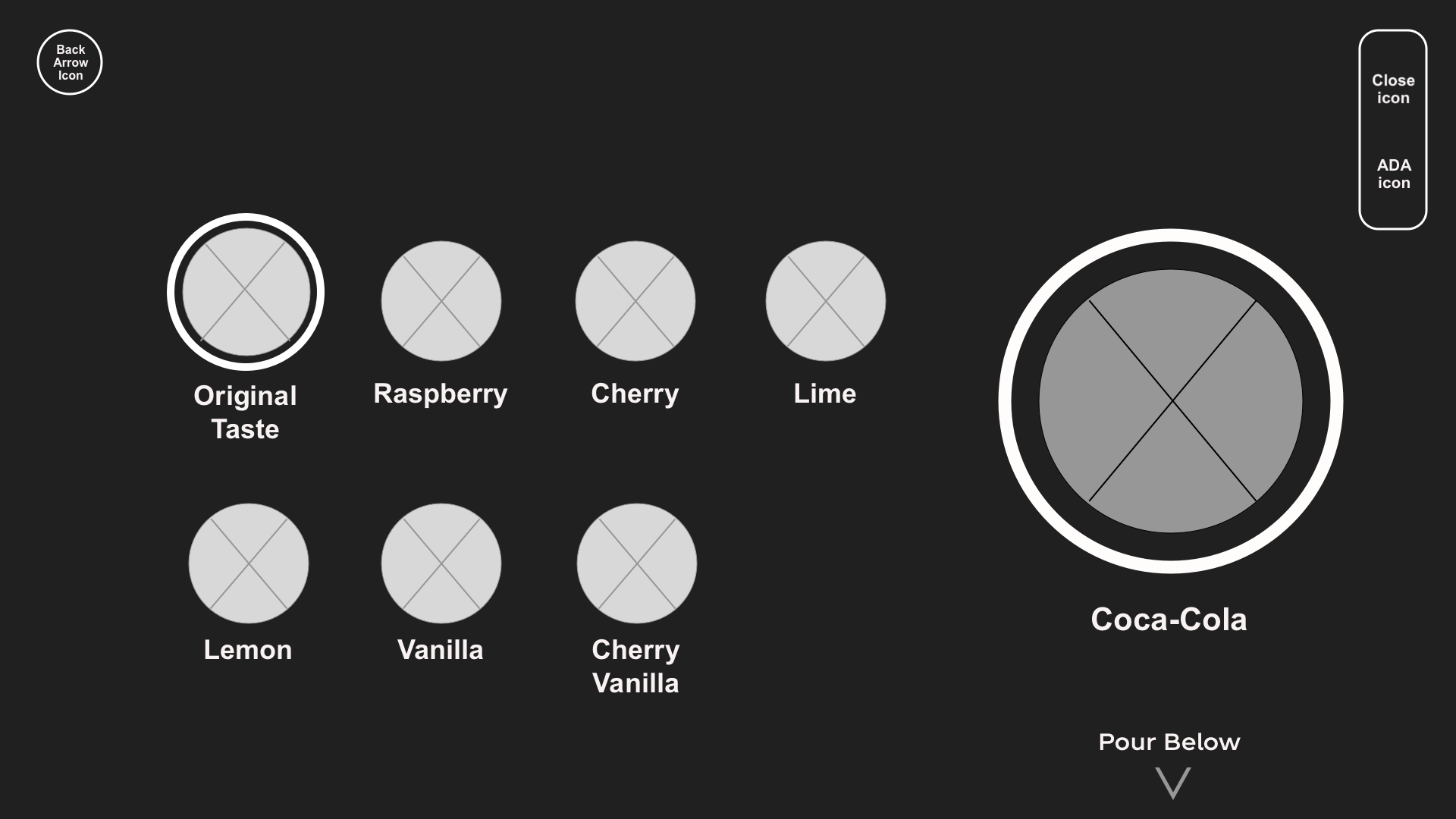
Beverage Selection Wireframe with Caption 1
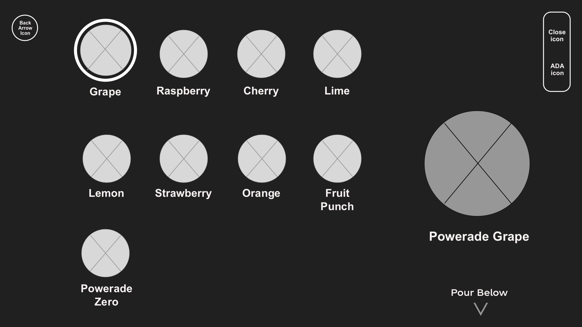
Beverage Selection Wireframe with Caption 2
Key Takeaways
Just because someone has a disability, it doesn’t mean he/she is “courageous,” “brave,” “special,” or “superhuman.” People with disabilities are the same as everyone else, and they’d like to be treated as such.
Reflection and the Future of ADA Freestyle Redesign
It all begins with an idea. Maybe you want to launch a business. Maybe you want to turn a hobby into something more. Or maybe you have a creative project to share with the world. Whatever it is, the way you tell your story online can make all the difference.
Don’t worry about sounding professional. Sound like you. There are over 1.5 billion websites out there, but your story is what’s going to separate this one from the rest. If you read the words back and don’t hear your own voice in your head, that’s a good sign you still have more work to do.
Be clear, be confident and don’t overthink it. The beauty of your story is that it’s going to continue to evolve and your site can evolve with it. Your goal should be to make it feel right for right now. Later will take care of itself. It always does.

