Netflix Anyone?
Netflix GroupShare App Feature
April 2019
A case study introducing a social sharing feature for Netflix watchers.
What if you could recommend Netflix TV Shows and Movies to your friends and family…in real time?
Team:
Owen Clark, UX Researcher
Lauren Ogg, UX Designer
Asha Jones, Project Manager & UX Designer
Table of Contents
I. Introduction
Project Overview
What we were asked?
II. Research
How we began our process?
How we looked at our competitors?
Affinity Mapping
III. Synthesis
KPI Success Measures
Minimum Viable Product (MVP)
IV. Definition & Ideation
Persona
How we were going to [Hypothetically] measure out success?
Visual Design
User Journey Map
Information Architecture
V. Deliver and Test
Wireframing & Usability Testing
High Fidelity Design
User Test 2.0
VI. Reflections
What had failed? and We we changed?
Next Steps
I. Introduction
Project Overview
A team of 3 with myself included, were tasked with a project brief. We were given the company Netflix to use as a case study, and tasked to increase social interaction amongst users.
The key objective was to increase overall profits through brand loyalty.
Design Challenge & Solution
Challenge: How might we allow Netflix users to participate in
recommending and viewing content to/from friends?
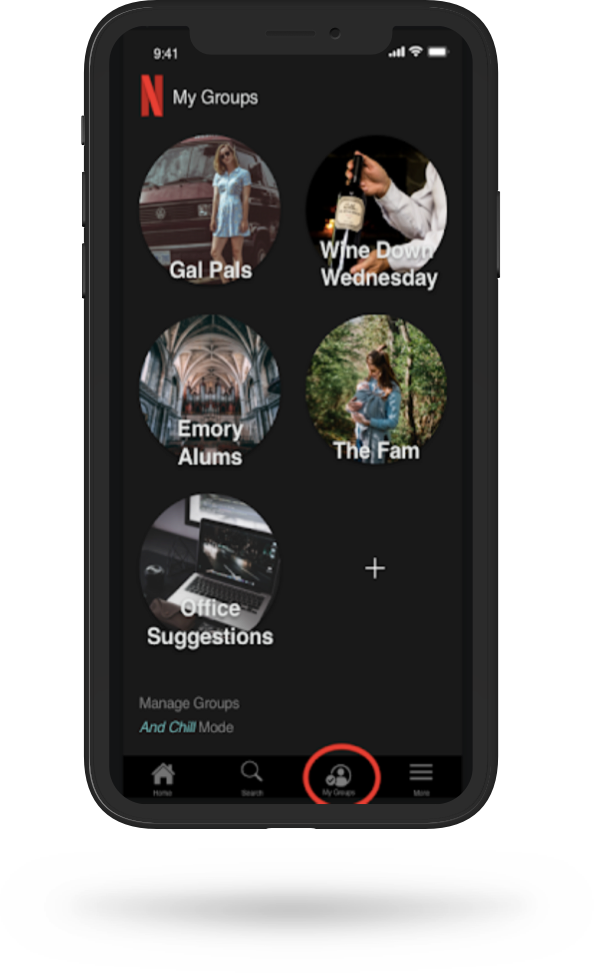
Solution: A feature within the Netflix app that will provide a
shared list of Friend Recommendations
Roles & Responsibilities
1 of 3 Designers.
I became our team’s “go-to” for project tracking, note-taking, and report compiling. I assisted with the initial brainstorming and synthesis sessions, along with journey mapping, conducting a Competitive Analysis, Wireframe Sketches, Usability Testing.
Project Duration
April 2019; 2 Week Design Sprint
What we were asked?
During weeks 5 & 6 of our General Assembly bootcamp, our team was tasked with creating a social feature for our client, Netflix. Although this project was hypothetical, my team addressed this ask like it was from an actual client. As such we made sure to address both business and user needs.
This project was exciting for me and my team, because we are all Netflix bingers who need a way to find TV shows and movies quickly.
II. Research
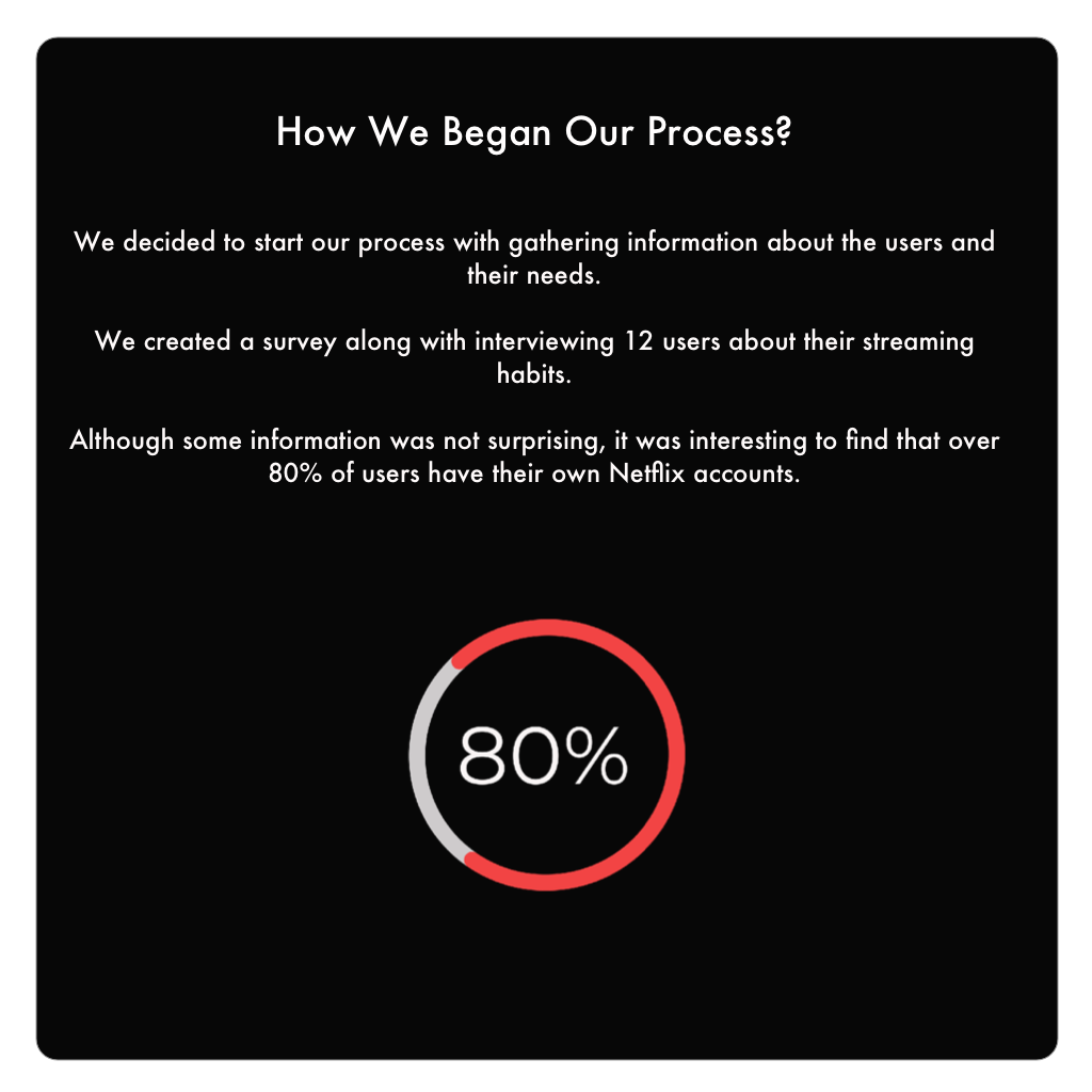
How We Began Our Process?
To begin, we created a research plan to further ideate what are plans were.
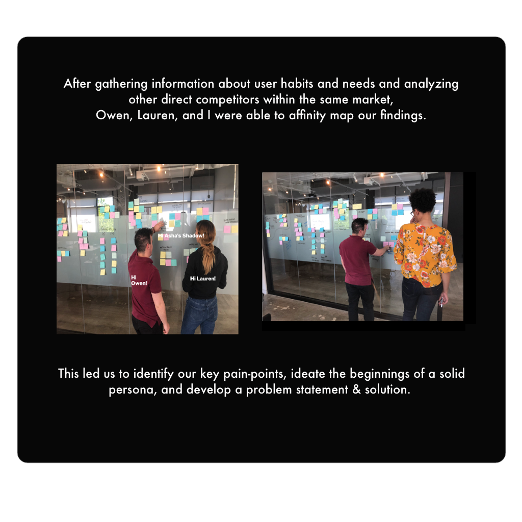
Affinity Mapping
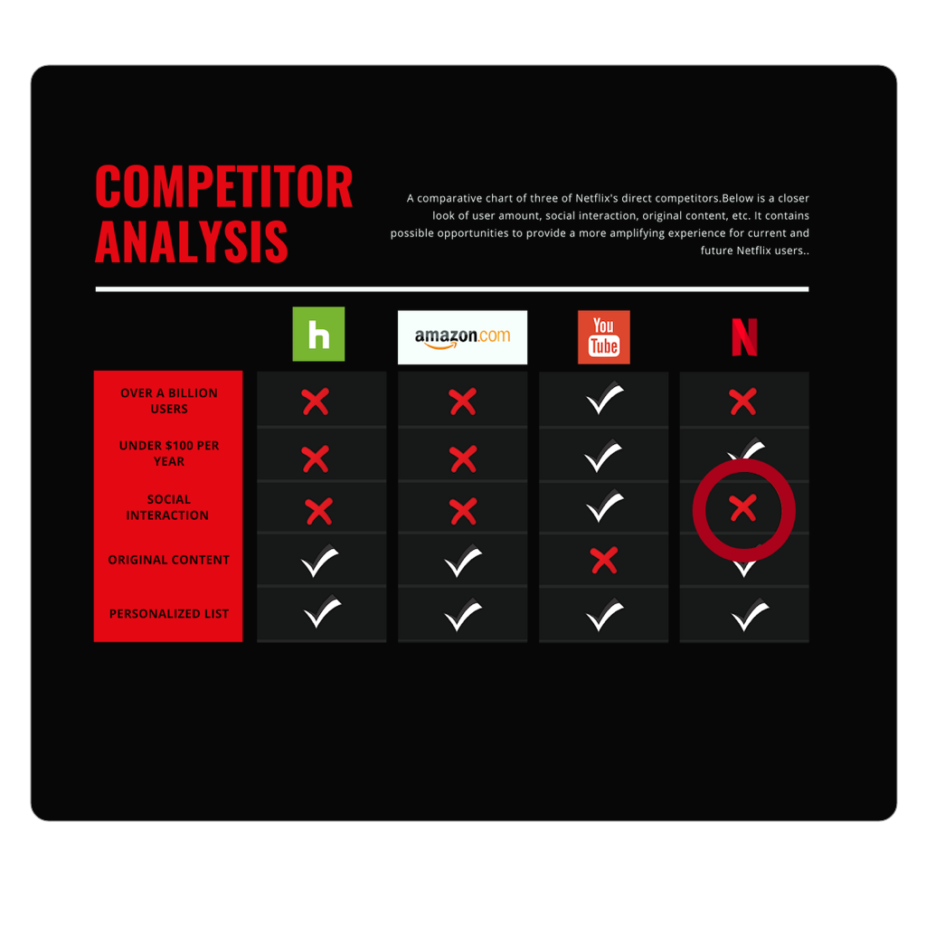
• In order to get a sense of the current landscape, we conducted a competitive analysis among the top streaming services. We addressed the overall number of users, price, a social interactive feature, original content, and personalization.
• YouTube was the clear leader in this market. Netflix could compete with YouTube if we were able to capitalize on its social interaction feature. YouTube is the only platform that has his capability. Thus we found our area of opportunity…
How did we looked at our Competitors?
• In order to get a sense of the current landscape, we conducted a competitive analysis among the top streaming services. We addressed the overall number of users, price, a social interactive feature, original content, and personalization.
• YouTube was the clear leader in this market. Netflix could compete with YouTube if we were able to capitalize on its social interaction feature. YouTube is the only platform that has this capability. Thus, we found our area of opportunity…
MVP
Minimum Viable Product
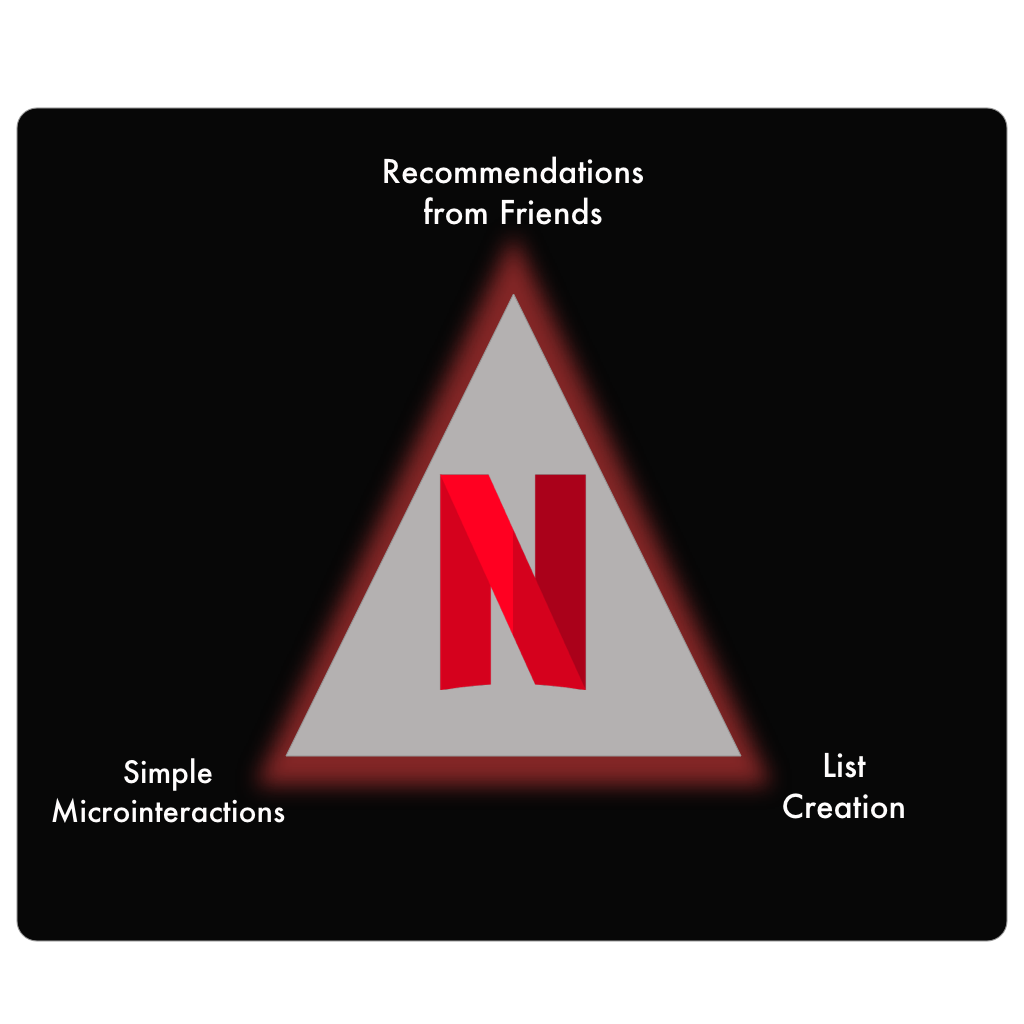
From this, we have developed three key, simple features.
The first is the ability to get and give recommendations from friends.
Secondly, simple navigation and interactions.
Finally, the ability to create lists and share them.
III. Synthesis
KPI Success Measures
Overall Goal: 30% increase in viewer habits
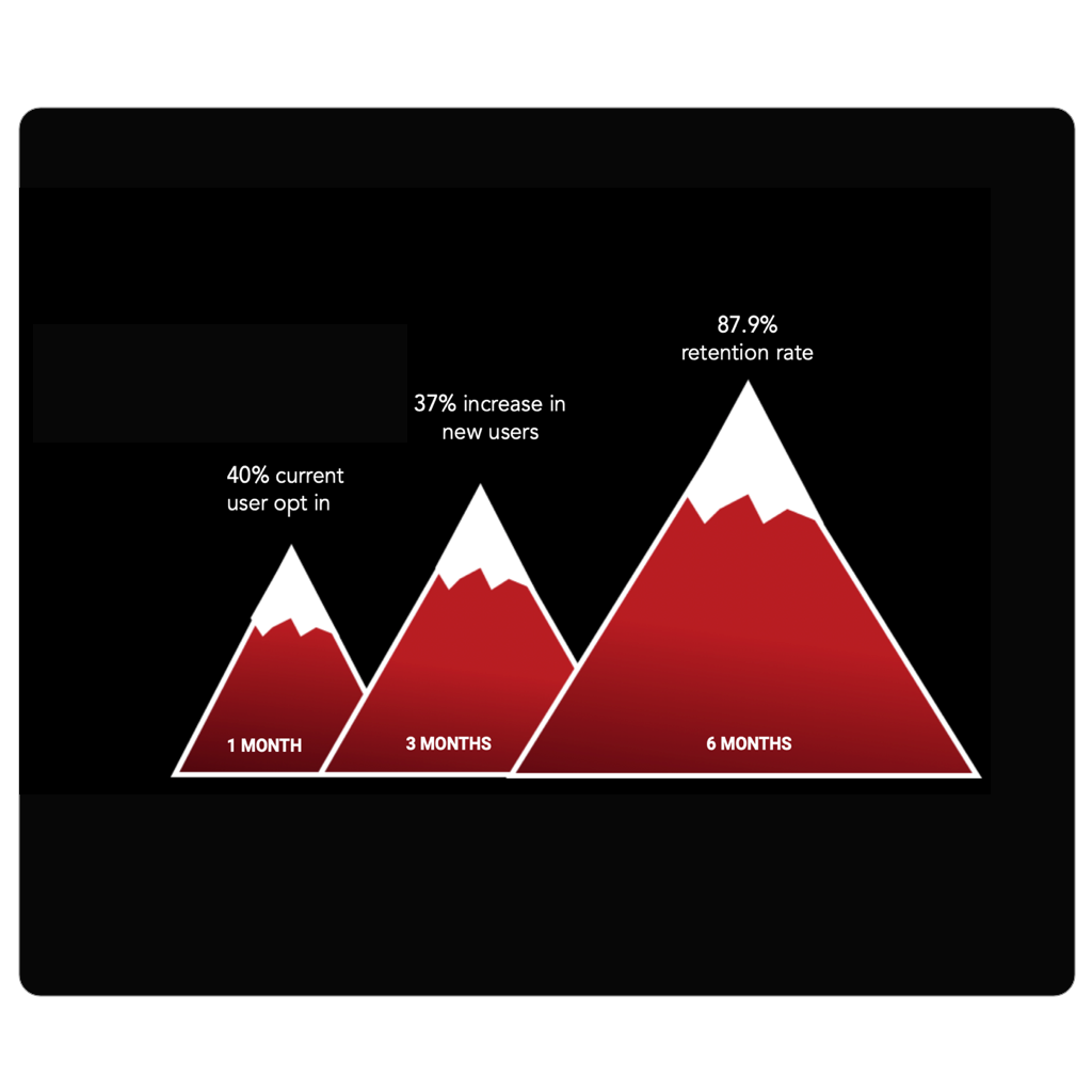
Once the feature is enabled, on the left is an incremental diagram that portrays some key performance indicators which would map out success over a 6-month period.
During the first month, we hope to see a 40% current user opt-in increase.
Within three months of the feature delievery, we hope to see at least a 37% of new users altogether.
And finally, within six months of the feature delievery, we hope to gain at least a 87.9% rentention rate.
IV. Definition & Ideation
Persona
In our ideation phase, the team created a user persona based on supplemental research and further insights.
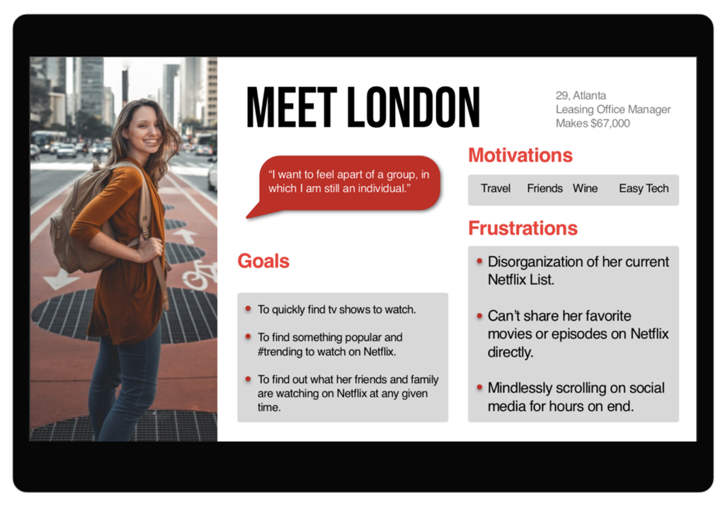
Meet London: a Millennial hailing from Atlanta, GA. After a long day, there’s nothing that London loves more than to kick her feet up and catch up on her favorite shows on Netflix…only problem is she can never decide on a show or movie!
How are we going to [hypothetically] measure our success?
Visual Design
To begin our design studio, we wanted to reference Netflix’s style guide. We were fortunate enough to find their abbreviated style guide online and followed the color and font scheme.
User Journey Map
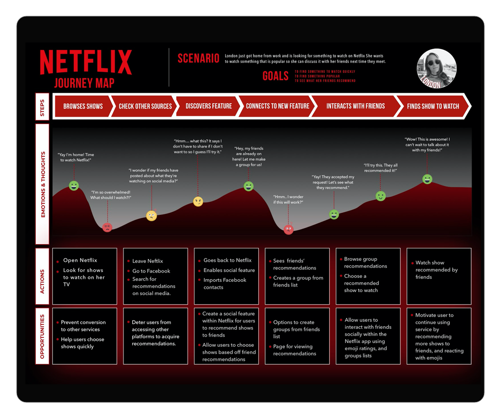
The team created a journey map which allowed us to see how the Netflix GroupShare feature will be used from a user’s perspective.
Information Architecture
Sitemap
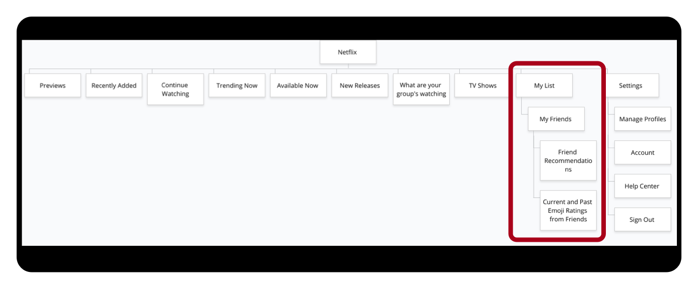
The structure of the Netflix App is straightforward: The homepage displays global navigation links plus content. The main addition is the “My List” sections, which leads to a variety of pages of relative stature.
V. Usability Testing & Delivery
What Our Initial Wireframes looked like?
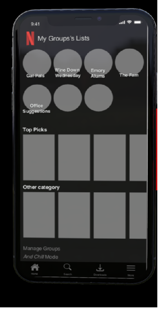
We originally built out the first set of wireframes to mimic the Netflix layout exactly. Through numerous user tests, we soon found that it was too busy for the users.
They wanted to see just what they were looking for (I.e. their list of groups) rather than an explosion of information. We toned down the amount of information and shortened the header name.
User Test 2.0
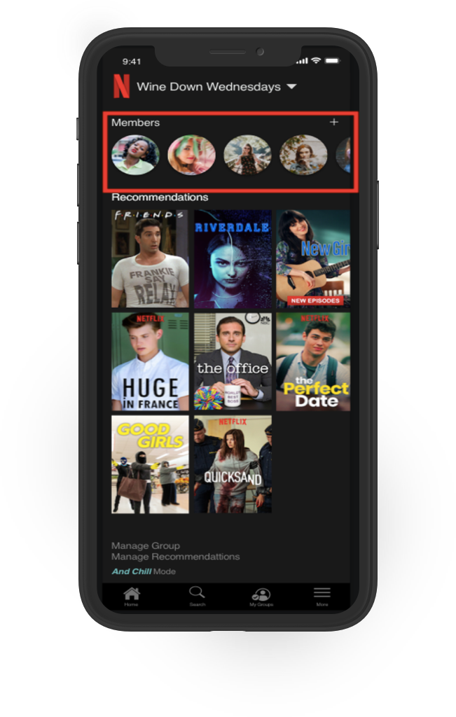
In this portion of the user testing, we found that the navigation of the group members page was rather intuitive...which is a good thing!
Users had no trouble whatsoever locating where to add members and viewing what the members of their groups recommend.
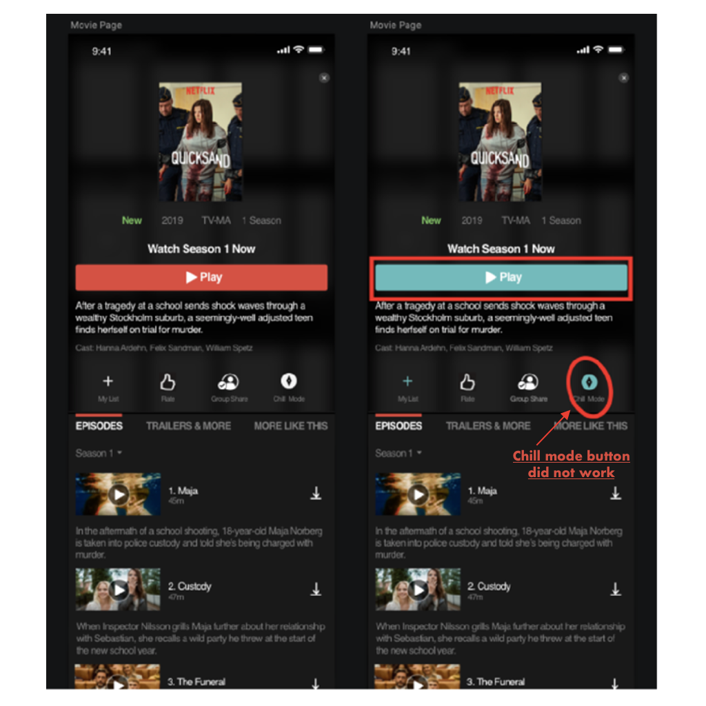
In this page, we clarified what it meant to be on chill mode by highlighting the play box blue.
Through our user interviews, we found that people are concerned with their privacy, specifically when it comes to social media. We wanted to address this direct worry by creating a privacy mode. This would allow London to go off the grid for some time. Maybe she hasn’t watched Game of Thrones yet and is trying to binge it before her friends find out. Maybe she just is in a funk that day and doesn’t want to communicate with the world. Whatever the reason, we wanted to give London the option.
Through user testing, we found that users had a really hard time understanding what “And Chill” mode was. It was not intuitive. They preferred a more direct name. To one user, the phrase “and chill” indicated that it was a feature for watching with your friends. This is the opposite of our intentions.
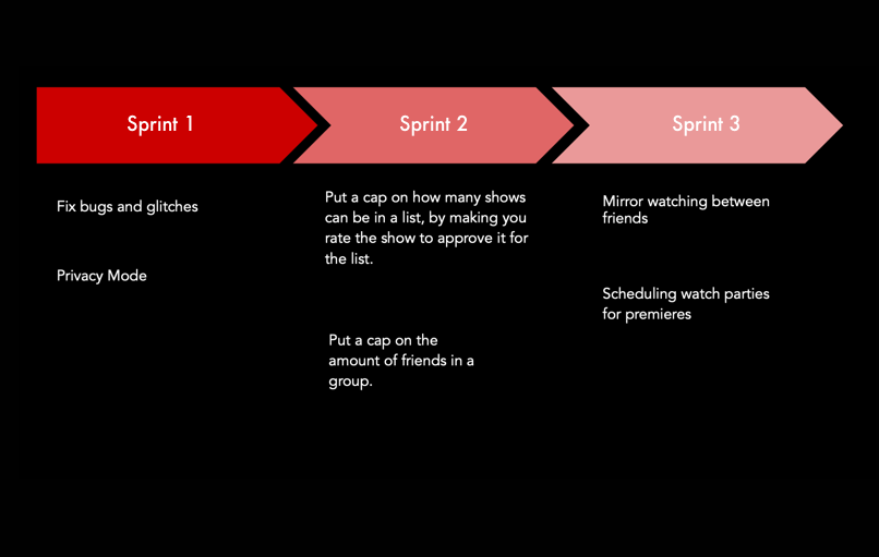
We decided to move this feature to our next sprint. In this sprint, we will conduct more interviews and clarify what users want this feature to be called. Users felt that the name for a privacy mode should be direct and clear. This is something to consider, research and test in our next steps.
VI. Reflections
What had failed & What we changed?
We had fairly minor iterations overall. We simply changed the red to a blue color to indicate a different mode. We also changed the color of the icon itself. Unfortunately, the feature that we were very excited about completely failed. During our user interviews, many users expressed:
They were worried about their privacy when using a social sharing feature.
That they did not want another social media platform.
Wanted the option to be able to privately view their TV shows and movies.
I’m thankful for the collaboration I’ve experienced with my team. We all had great ideas on how to best serve the user’s pain points.

