Vanderbilt University: Big VU Navigation Project
A comprehensive overhaul of Vanderbilt’s fragmented website navigation, improving wayfinding across multiple properties and enhancing user experience for students and faculty alike.
Website
www.vanderbilt.edu
Role
Lead Product Designer & Project Manager
Client
Vanderbilt University
Date
November 2023 - March 2024
Project Overview
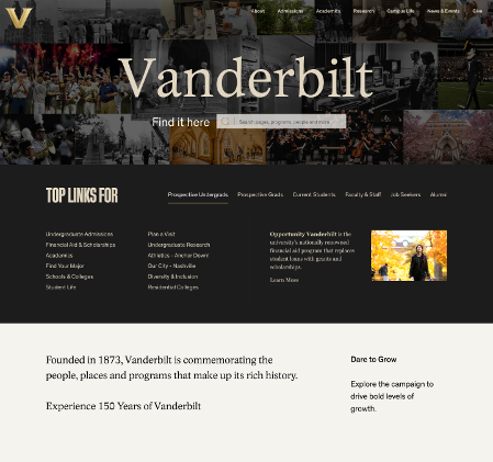
Currently, it's easy to "get lost" within the Vanderbilt website ecosystem. Mockup Gif with Quote about Student wanting the student hub feature.There is a need to clarify pathways around and between VU web properties, with improved orientation within the ecosystem. Digital strategies wants to create a unified, scalable, browsable navigation system that promotes clear user journeys and wayfinding.
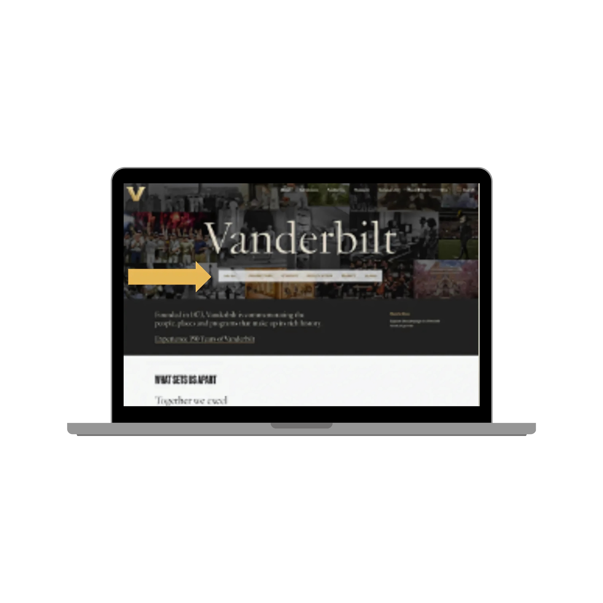
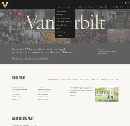
Gives each persona a clear direction of where to go from the homepage.
My Role
As both Project Manager and UX Designer for the Big VU Navigation Project, I led the initiative from discovery to implementation, overseeing user research and design. I sourced incentives for participants, coordinated with our data team to leverage Qualtrics, and collaborated with Userlytics for usability testing. My efforts ensured a cohesive, user-centered navigation system that meets the needs of students, faculty, and prospective visitors while aligning with Vanderbilt’s goals
The Challenge
The Vanderbilt website ecosystem was vast and, frankly, a bit of a mess. Users—especially current students—felt disconnected from the main site, often relying on Google to find what they needed. The challenge was clear: simplify the navigation, create clear pathways, and make the site feel like home for every user.
“It can be hard to navigate the website and sometimes it is easy to get outdated pages/information”
The Process: A Three-Part Study
-
Set a Baseline
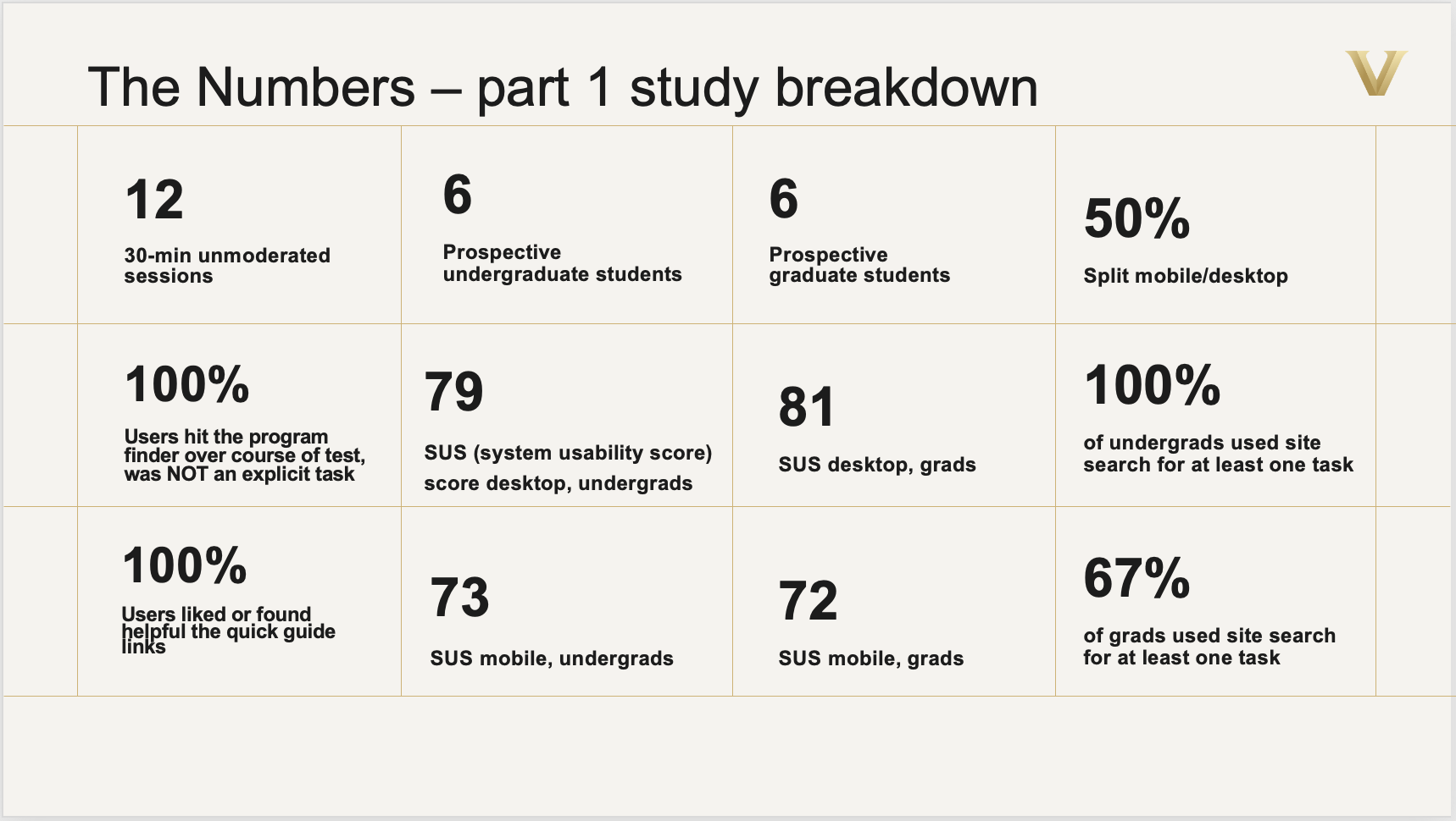
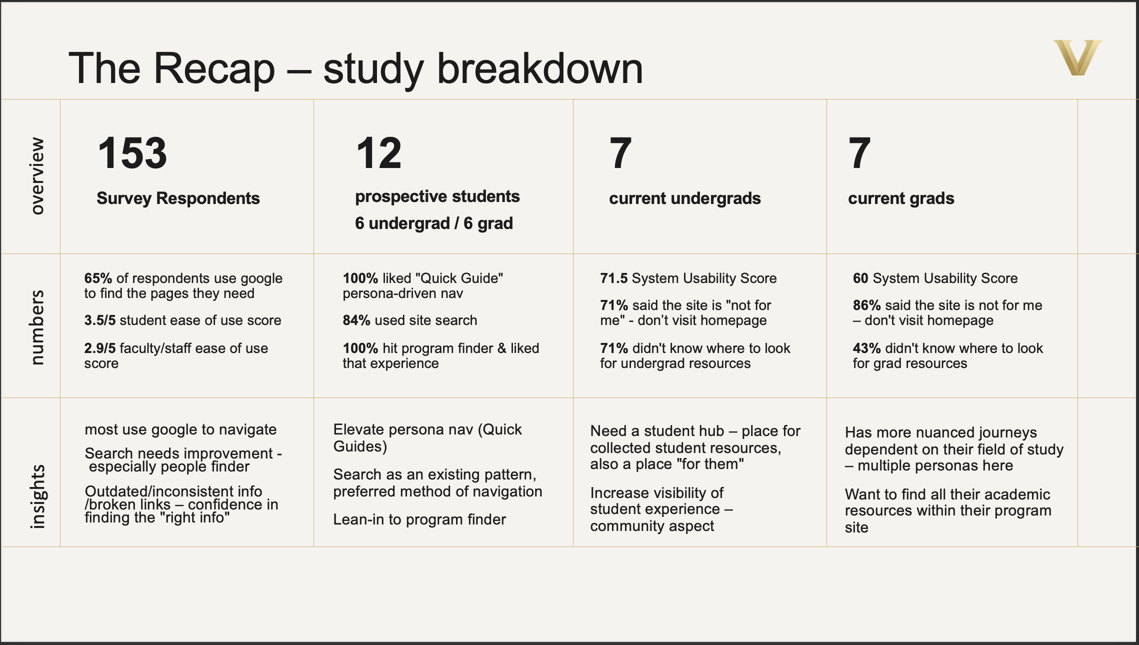
We started by conducting user interviews with students, faculty, and prospective students to understand their needs and pain points. This informed our decision to focus on content prioritization and an intuitive navigation structure.
-
Journey Discovery
Next, we dove into understanding the users. Using System Usability Scores (SUS), user journey exploration, and task analysis, we uncovered the needs and motivations of our users. This wasn’t just about mapping out journeys—it was about reimagining how users interacted with the site and identifying ways to make those interactions smoother and more intuitive.
-
Validate, Understand & Test
With a clearer understanding of user needs, we moved into validation. Through in-depth interviews, we explored the 'why' behind user behaviors and tested prototypes to ensure our solutions hit the mark. This phase was all about refining the design and making sure we were solving the right problems.
Solution #1:
-
We implemented sticky navigation and dropdown menus to reduce clicks and make content more accessible. Users could easily see where they were within the site, and the persistent state of the navigation encouraged interaction. No more getting lost—just a clear, straightforward path to the content they needed.
The Solutions
Solution #2:
-
To further enhance the experience, we introduced persona pathways in the top-level navigation. Each user type—students, faculty, prospective students—had a clear, personalized route from the homepage. These pathways acted as hubs, providing a central place for each persona to find relevant resources.
Solution #3:
-
Recognizing that many users preferred searching over traditional navigation, we elevated the search functionality. By improving the relevance and accuracy of search results and incorporating filters for people, programs, and pages, we leaned into existing user behavior. Combined with persona pathways, this made the site feel more personal and user-friendly.
The Impact: Validating Hypotheses
The impact was immediate. Our newly implemented design system: Future VU is a big improvement for usability.
No issues navigating between sites in newer themes
easier to orient
Home “V” logo link consistently works.
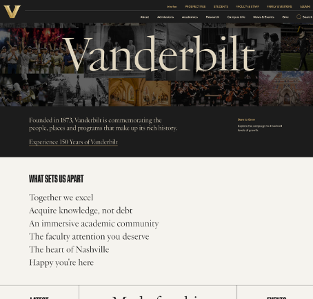
The sticky navigation and drop-downs were quickly implemented, providing a more seamless user experience.
Preferred and expected user behavior is to open a new browser tab when accessing new sub-site.
Russell M., Graduate Student
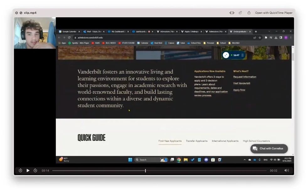
I would really like to see these quick guides promoted up higher on the page or in the menu.
Faculty Member
The search function is HORRIBLE. Truly. So many dead links, irrelevant results, and almost never the real thing I am looking for."
Reflection - A Work in Progress
The Big VU Navigation Project was a big win, but like any complex project at a place as large as Vanderbilt, it’s still a work in progress. With so many voices to consider, it was challenging to 'make everyone feel heard.' While we focused on current and prospective students, I wish we could have expanded our research to alumni, employees, and even parents for a more holistic view.
Implementing a search engine on the homepage turned out to be trickier than expected. There were technical hurdles that made it a tough sell. The developers mentioned the difficulty of pulling data from Vanderbilt’s extensive digital ecosystem—it might have been a CMS issue or just the challenge of adding another big task to their plate.


